The Temperature Dial: Painting Greys That Look Chosen, Not Unpainted
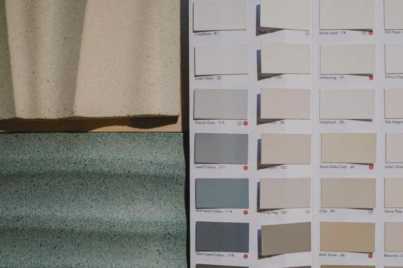
Grey gets a rough deal. It is the colour we reach for when we do not want to make a decision, the default undercoat, the sensible choice. And yet a grey miniature can be one of the most striking things on a table — or one of the most forgettable. The difference is rarely the number of pots involved. It is whether the grey was chosen.
At Grey Matter Figures we spend a lot of time with unpainted figures, and that is not a bad place to start. Bare plastic and resin have a natural grey that reads as potential. Painted grey should read as intent. If your finished model looks like it is still waiting for its first coat, something has gone wrong — usually temperature.
Start With Temperature, Not Brand
Every grey on your shelf leans somewhere. Warm greys have a whisper of yellow, brown or red in them. Cool greys drift towards blue, green or violet. Neutral greys sit between the two, or contain enough of both to cancel out the bias.
This matters because our eyes compare colours constantly. A cool grey next to a warm brown reads as icy and clean. The same grey next to a blue cloak can look almost beige. Put a warm grey beside a red tunic and it may pass for stone; put it beside bare resin and it can look like dirty plastic.
Value is the other half of the story. Temperature tells you what kind of grey you have. Value tells you whether anyone will see it from three feet away. A figure can have four beautifully blended greys and still read as a single flat silhouette if all four sit at the same lightness.
Three Swatch Tests You Can Do Tonight
You do not need a colour theory textbook. You need a bit of white plastic card, a brush and ten minutes at the kitchen table.
1. The white-paper edge test
Paint a short stripe of each grey next to a patch of pure white and a patch of black. Leave it to dry, then look at it under a window in daylight and again under your painting lamp. Warm greys will show their brown or yellow edge against the white. Cool greys will look blue or green by comparison. Neutral greys will sit quietly in the middle. This test is especially useful in a British autumn, when the window light is already doing strange things to your perception.
2. The two-pot neighbour test
Paint two greys side by side, touching. Do not judge them separately. Judge the seam. If one suddenly looks much warmer or cooler than you expected, you have found its bias. This is also the fastest way to spot a grey that will turn muddy when layered over another. If the seam looks like a dirty smudge rather than a deliberate shift, the two pots are probably too close in value and too far apart in temperature.
3. The squint-and-photo test
Squint at the swatch until the edges blur, then take a phone photo and switch it to black and white. You are looking for three distinct values: a shadow, a mid-tone and a highlight. If everything collapses into one grey mass, no amount of neat edge highlighting will save it on the tabletop. If the values separate clearly, you are already ahead of most grey armies.
Recipes for Warm, Cool and Neutral Greys
You can build all three families from a handful of pots: a mid-grey, a dark grey, an off-white, a khaki-brown and a deep blue. No need to buy a whole range. The trick is to add temperature in small amounts and test as you go.
Warm grey
Start with four parts mid-grey to one part khaki-brown. That gives you a stone-and-dust base that still reads as grey rather than brown. For shadows, add a little dark brown to the mix instead of pure black — black will cool the whole thing down and flatten it. For highlights, add bone or warm off-white. This family is brilliant for worn stone, dusty cloth and older armour that has seen a few campaigns.
Cool grey
Start with five parts mid-grey to one part deep blue. Keep the blue timid; you want a frosty edge, not a blue army. Shadows can take a touch of dark blue-grey or navy. Highlights should go towards an icy off-white rather than a creamy one. This is the grey of clean steel, cold moonlight and elite troops who have clearly never done a day of manual labour.
Neutral grey
Mix equal parts of a warm mid-grey and a cool mid-grey, then adjust with off-white or dark grey until it sits between them. Neutral grey is not boring if you give it a proper value range. Use a dark neutral for the deepest recesses, the mid-grey for the bulk and a bright off-white for the highest edges. It is the safest choice for beginners, but only if you resist the urge to shade it with black and highlight it with pure white. That combination is neat, but it is also why so many grey figures look like grey figures.
Armour, Cloth and Stone Are Not the Same Job
Grey armour wants contrast. It catches light along hard edges, so push the highlights and keep the shadows crisp. Cool and neutral greys work well here, especially with a tiny warm accent elsewhere on the model to stop it feeling cold.
Grey cloth wants softness. The transitions should be gentler, and the temperature can be warmer or more neutral. A little texture — stippling, thin glazes, a hint of weathering — helps the eye read fabric rather than plastic.
Grey stone wants variation. Real stone is not one flat grey. It has warm patches, cool patches, dirt and damp. A neutral base with a few subtle temperature shifts and a brown wash in the crevices will do more than any amount of drybrushing with a single pot.
Why Neat Grey Still Reads Flat
A grey figure often looks flat not because the paintwork is messy, but because the painter has been too careful. Three thin coats of the same mid-grey, a black wash and a light drybrush can produce something very tidy and very invisible. On the tabletop, under ordinary room light, it becomes a grey blob.
The fix is not more paint. It is more decision. Choose a temperature. Choose at least three values. Put a contrasting colour somewhere — a leather strap, a red lens, a brass buckle — so the grey has something to argue with. And check the model against its base. A grey figure on a grey base in a grey British winter room is a perfect storm of flatness.
Grey is not the absence of colour. It is a colour with a direction. Once you start treating warm, cool and neutral as three deliberate choices rather than one vague default, your grey miniatures stop looking unpainted and start looking chosen. That is the whole point of grey matter, after all.